Goodbye, WordPress: rebuilding GVRAT from the ground up, Transcon and all
How I moved a six-year-old virtual race off an aging WordPress site in about ten days: a new website, a coast-to-coast Transcon dashboard, finisher certificates, a results archive, automated daily updates and emails to hundreds of runners, with every number checked against the source. Updated a week later with what came next.
- Written by
- Naresh Kumar
- Published
- Reading time
- 11 min
- Topic
- Client stories
In the spring of 2020, with the world in lockdown, Lazarus Lake had an idea: a virtual race across Tennessee, about a thousand kilometres, logged one run or walk at a time from wherever you were. We planned for 2,000 runners. More than 19,000 signed up. I built the system that kept track of them all, and the Great Virtual Race Across Tennessee, GVRAT, became a race that people come back to every single year.
Six years later, it’s the Great Virtual Race Across The States. Each summer’s GVRAT is one region of a 3,361-mile line from the Atlantic to the Pacific, and runners who finish all five regions have crossed the United States on foot. We call that the Transcon.
The race grew up. The website didn’t.
This autumn, together with my co-race director Steve Durbin, I rebuilt all of it: gvrat.racing, a new Transcon dashboard, finisher certificates, a results archive for every past year, automatic daily updates, and the emails that go to our runners. It took about ten days.
This is the story of that move, and of the numbers we found along the way.
Where we started
The old gvrat.racing was a WordPress site on shared hosting. It had served us faithfully for years, but it had become a museum of every year we’d run: pages added in a hurry during a race and never taken down, results pasted into table plugins, and a menu that had grown one link at a time.
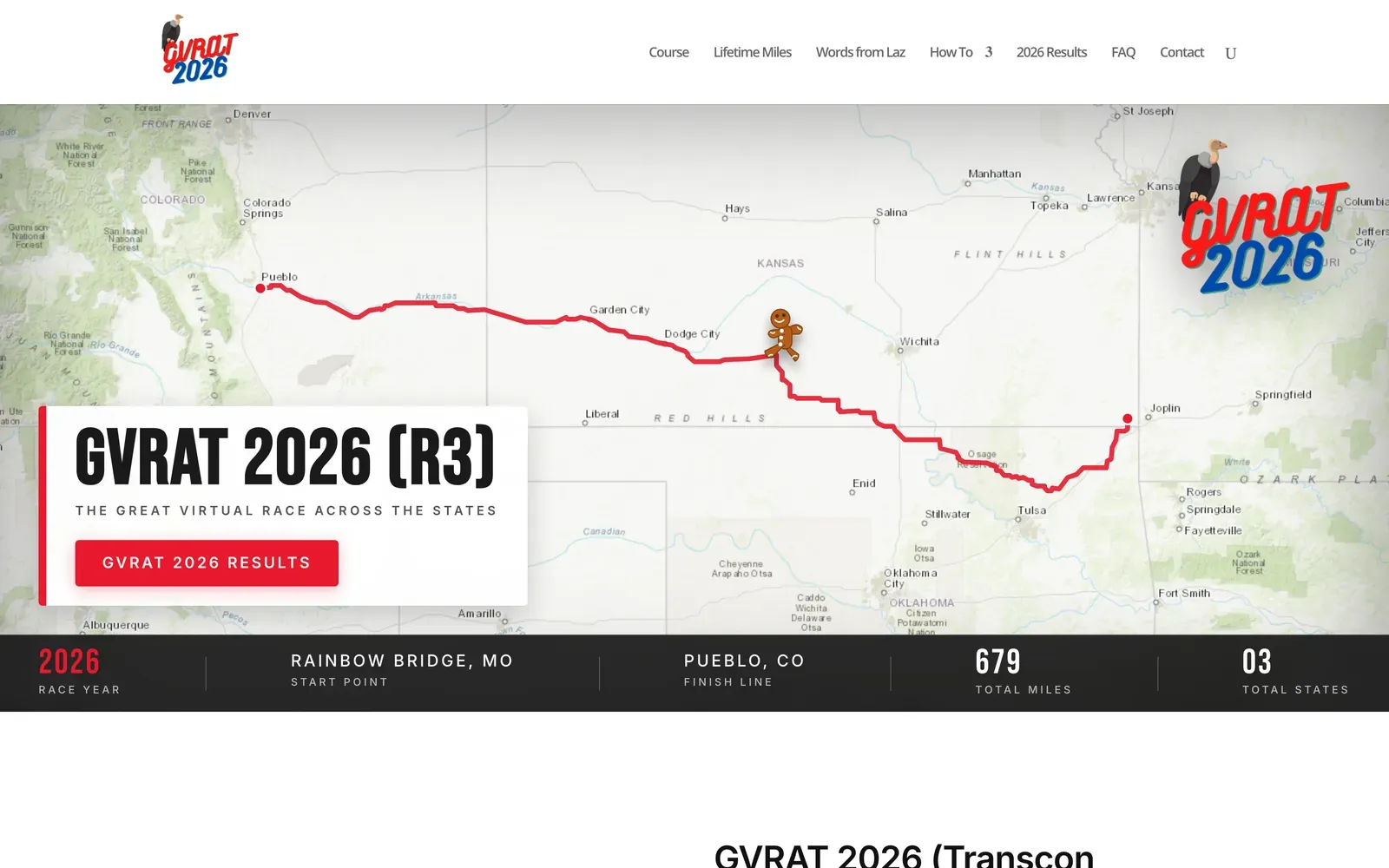
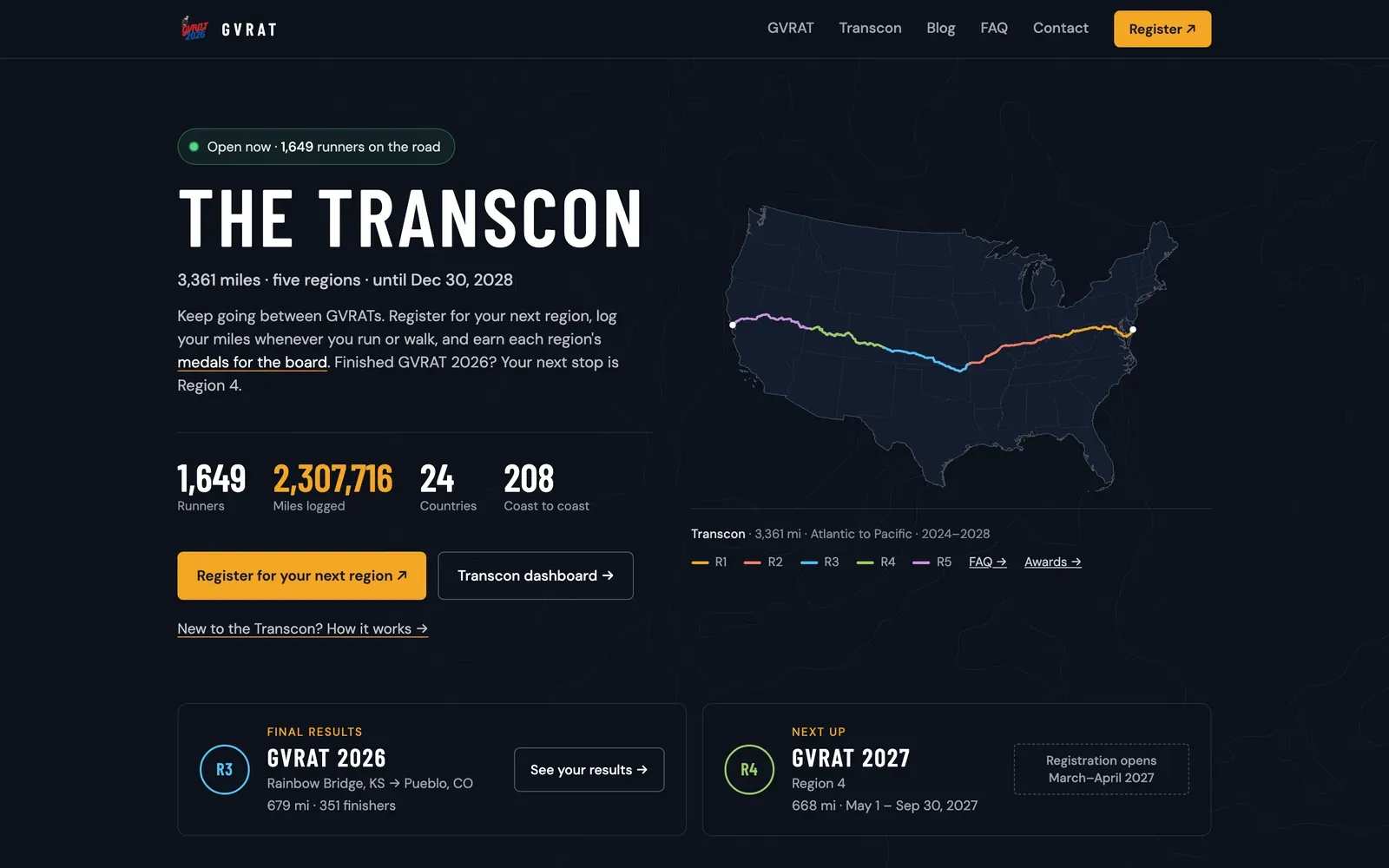
The same address, a week apart. Drag the bar, or use the arrow keys, to compare.
The bigger problem wasn’t how it looked. It was what it couldn’t do:
- Results were copied in by hand. Every update meant exporting from RunSignup, cleaning a spreadsheet and pasting it into the site.
- The Transcon had nowhere to live. A runner’s journey spans five years and several registrations, but every page on the site was about one year.
- Nobody could see the whole picture, including us. Who had finished which region? Whose medal had shipped? Those answers lived in spreadsheets on our own computers.
What I set out to build
Before writing any code, I asked the same questions I ask on every project:
- What does a runner come here to find out? Usually one thing: where do I stand?
- What do Steve and I need to stop doing by hand?
- What has to be true for runners to trust the numbers?
Those answers became four pieces, all linked together and all looking like one site.
1. A new home for the race
gvrat.racing is now a fast static site built with Astro. The home page leads with whatever is happening right now: between GVRATs, that’s the Transcon, with the live number of runners on the road and the miles they’ve logged.
Everything that used to be scattered now has one place: results for every year since 2020, the FAQ, how-to guides, Laz’s own writing, and two honour rolls.
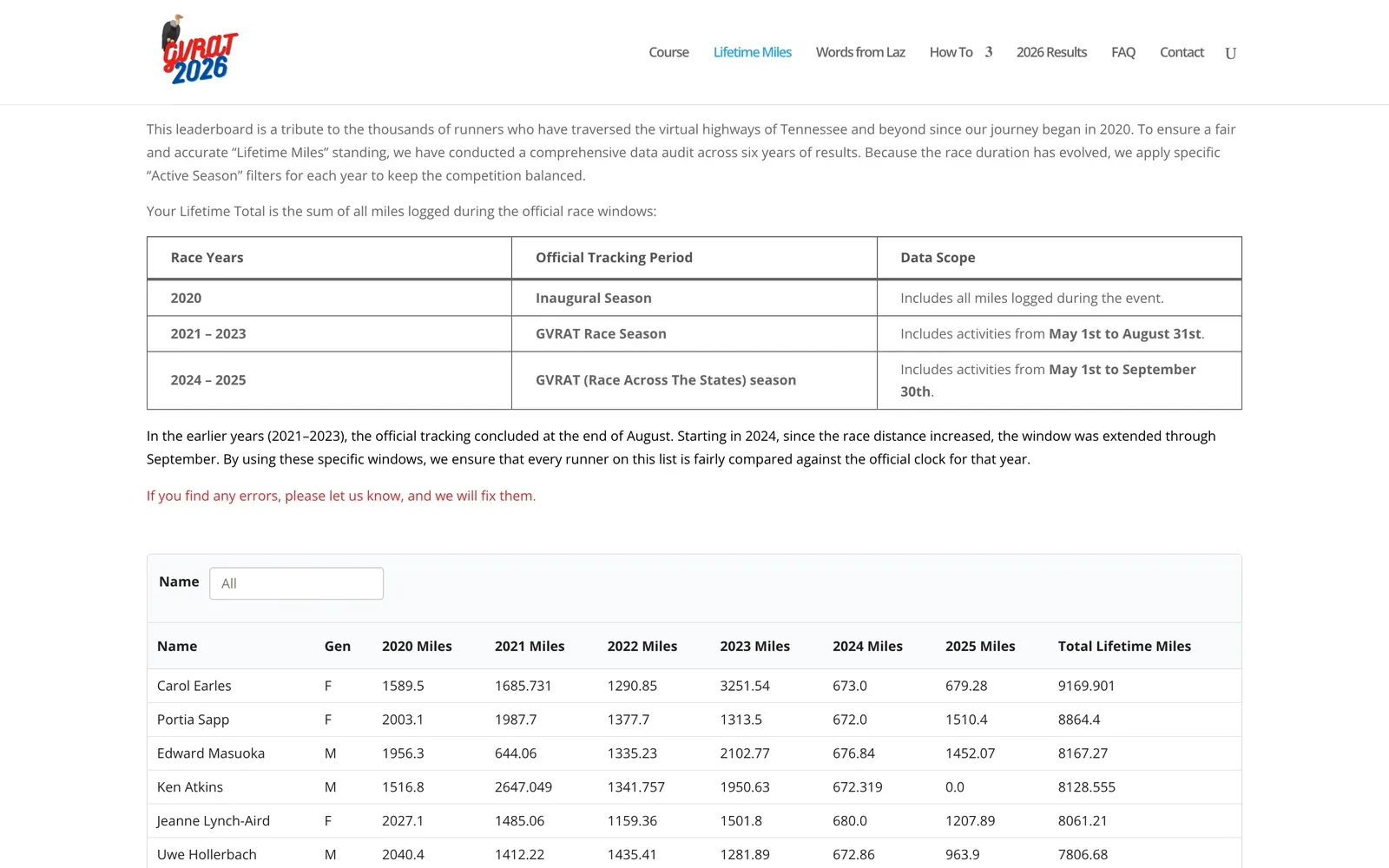
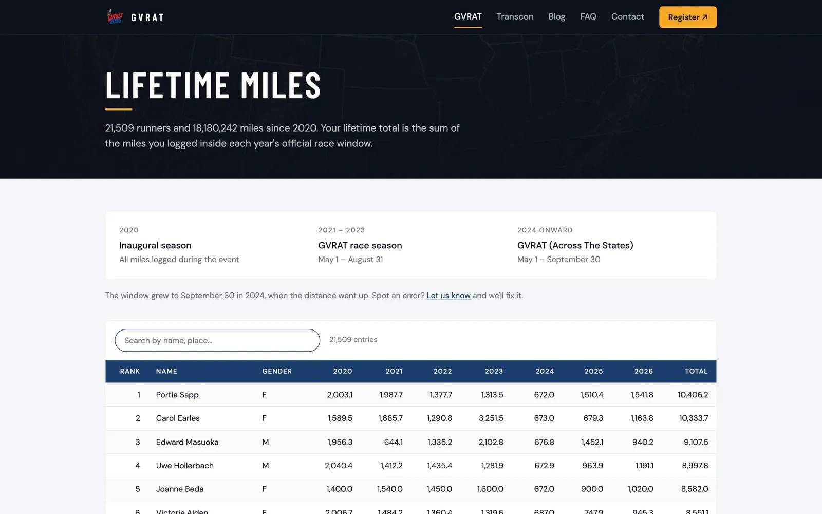
Lifetime miles: every official mile by every runner since 2020. 21,509 runners, 18,180,242 miles, searchable by name or home. Drag the bar to compare.
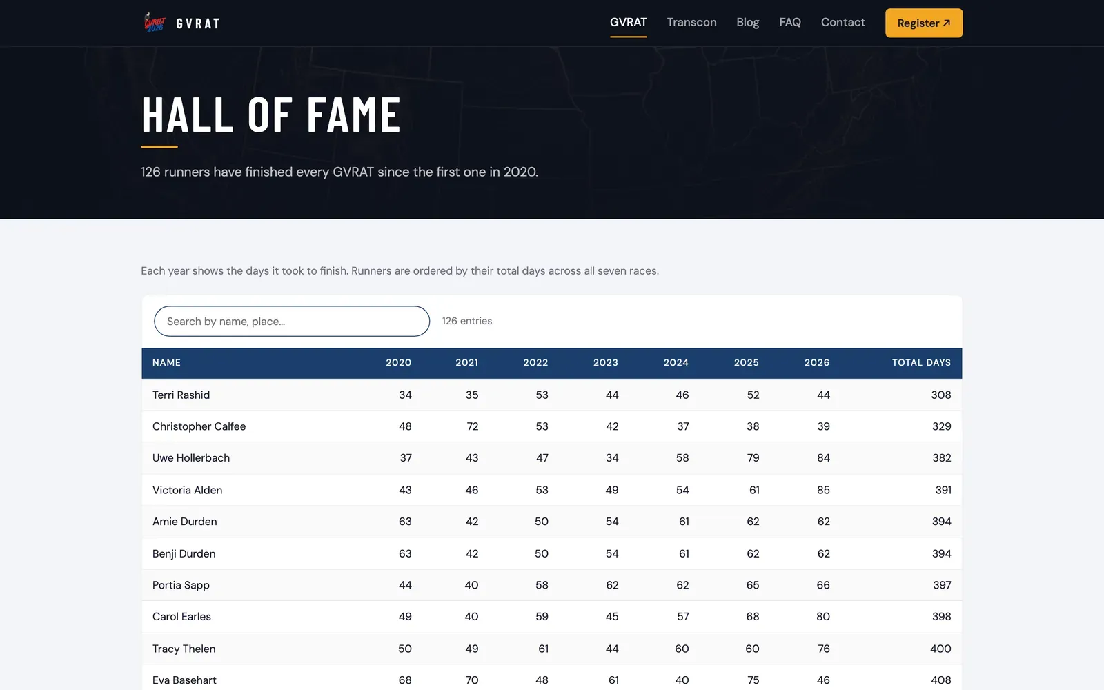
The Hall of Fame: the runners who have finished every single GVRAT since the first one in 2020.
Even the contact page got some care. It used to be two lines of text. Now it puts faces to the race:
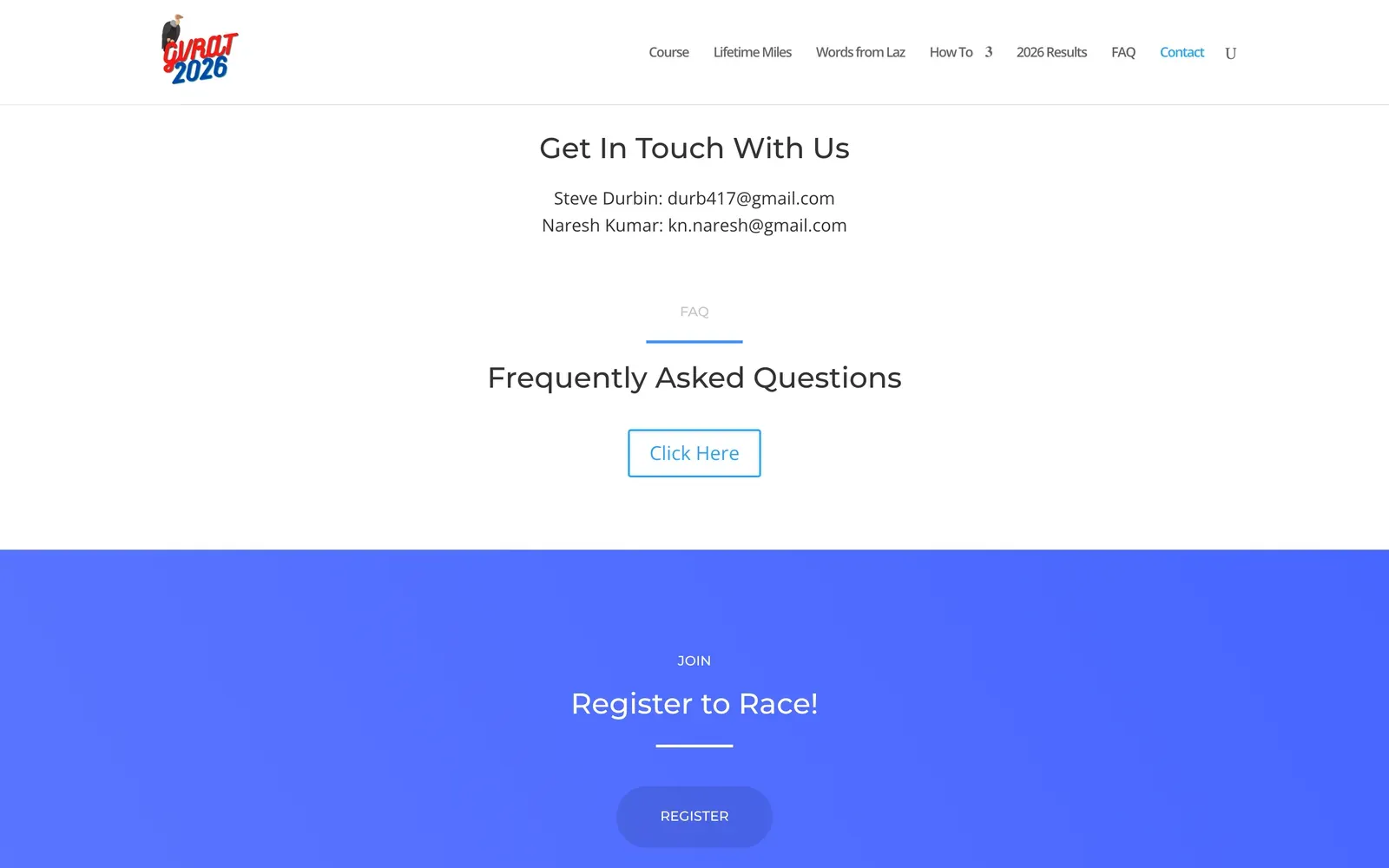
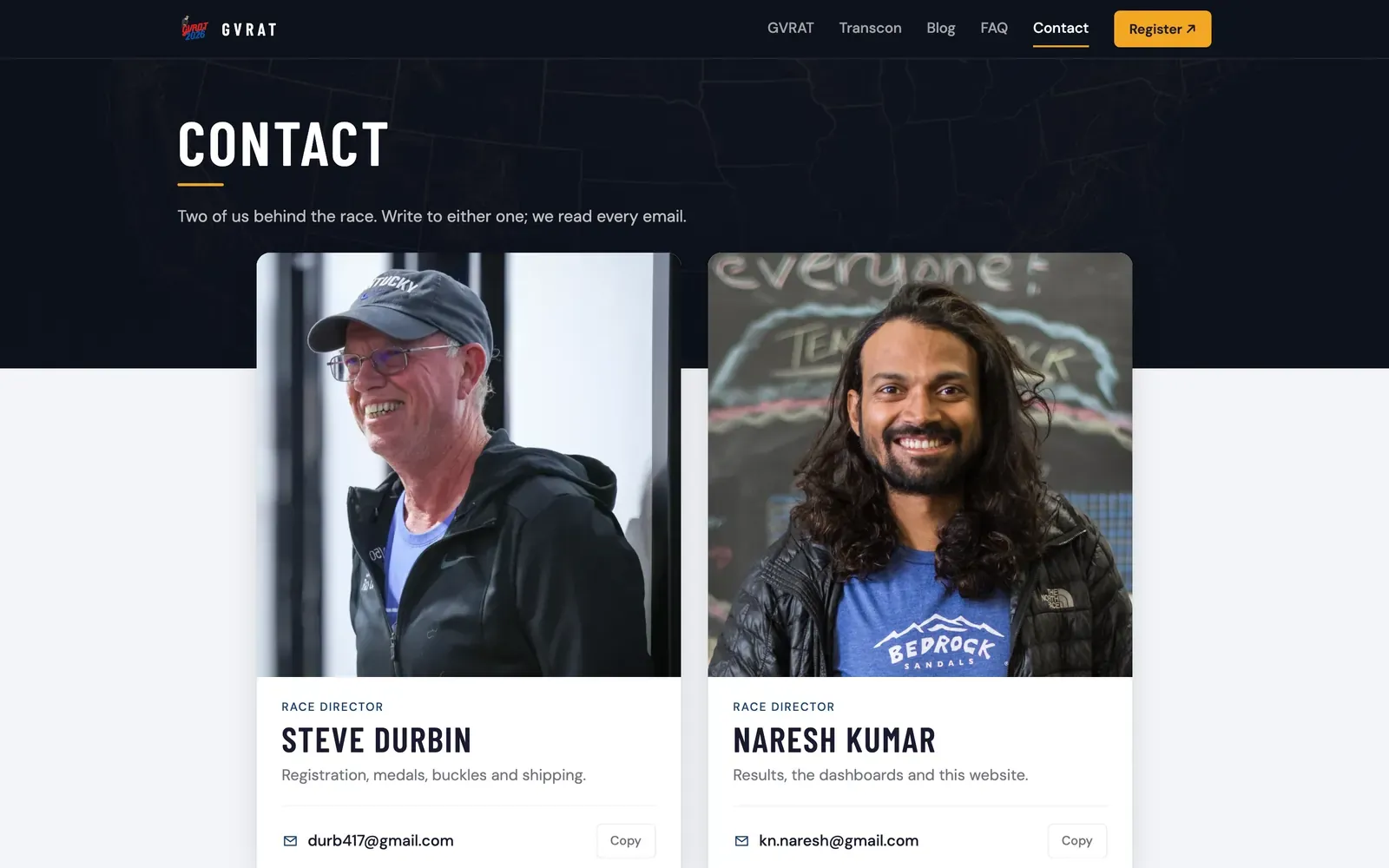
Before and after. Drag the bar to compare.
2. The Transcon, finally visible
This was the heart of the project. transcon.gvrat.racing follows 1,649 runners across all five regions, from 2024 to 2028.
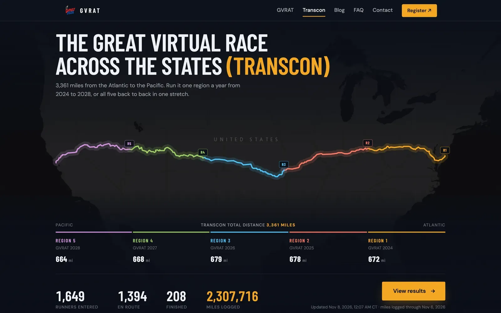
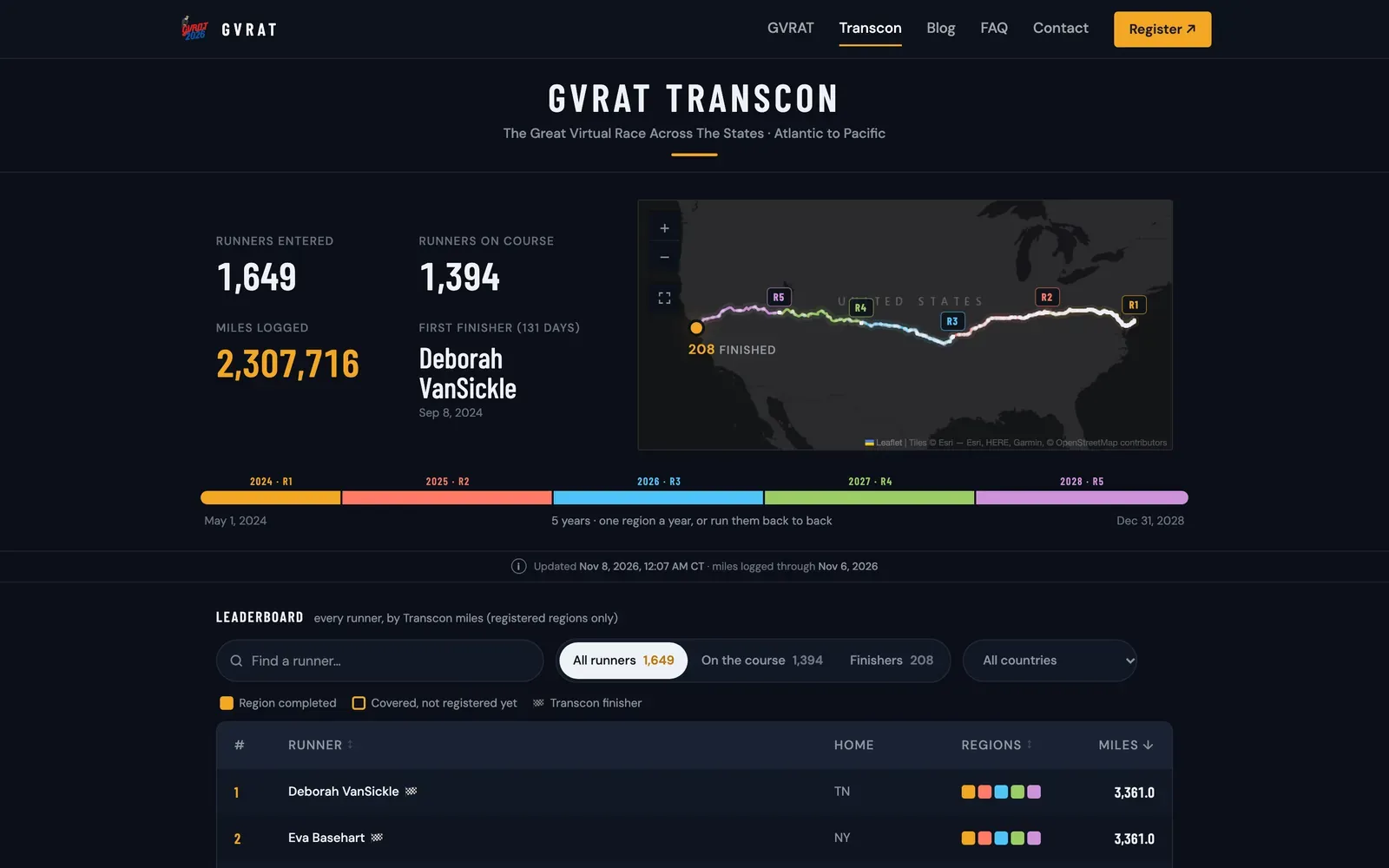
Every runner on one map, a timeline of the five regions, and a leaderboard ranked by miles. Finishers are ordered by the day they reached the Pacific.
Every runner gets their own page: where they are on the course, which regions they’ve completed, and, most usefully, what to do next.
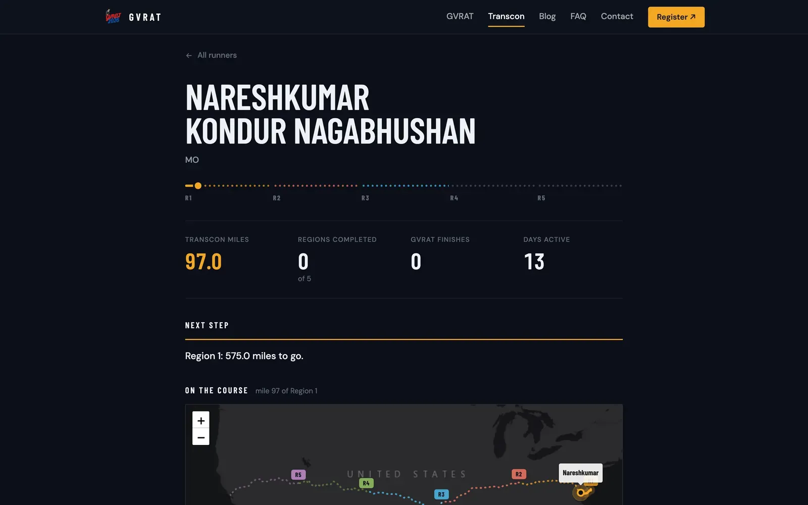
My own page, for honesty's sake. I'm a long way from the Pacific.
A week after launch, answering runners’ emails, I kept doing the same thing: search for a runner, open their page, then go all the way back to search for the next one. So every runner page now has its own Find another runner search, which ignores accents and suggests names as you type, and the leaderboard remembers your search when you come back to it.
The hard part was the rules, not the code
The Transcon sounds simple: run 3,361 miles. But it’s built from years of separate registrations, and the data has every quirk you’d expect from thousands of people typing into forms:
- One runner, many registrations. The same person can appear under a nickname one year and their full name the next, or with a typo in their date of birth. The pipeline groups entries into one runner using a series of careful fallbacks, while keeping twins who share everything but a first name apart.
- Miles count only where a runner has registered. A medal can only ship for a region someone has signed up for, so miles fill registered regions in route order. Extra miles aren’t lost. They wait, and the runner’s page tells them exactly which region to register for to put them to work.
- Every mile a runner logs counts. We ask runners to log each run in one place, but every activity they enter goes into their one cumulative total, so a runner who switches between a GVRAT entry and a Transcon entry never loses a mile.
- A fair cutoff. As on the GVRAT dashboard, a day only counts once it has ended in every time zone on Earth, so a runner in Hawaii and a runner in Tokyo always have the same number of complete days. The page says so in plain words: “miles logged through November 6.”
3. A certificate worth framing
Finishing the Transcon means crossing a continent. It deserved more than a line in a table.
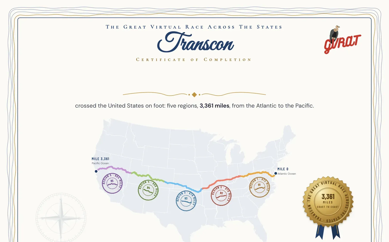
The finisher certificate. Each runner's name and finish date are added in their own browser when they download it. Nothing is stored or sent anywhere.
I designed it as a vector PDF: the route in its five region colours, a stamp for each region with its distance, and a gold seal. When a finisher presses Download your certificate, the page writes their name and finish date onto it and saves a print-ready PDF, signed by Laz, Steve and me.
The board
Every region medal is also a puzzle piece. Finishers can place all five on the GVRAT medals display board, a wooden map of the United States, 26 × 19.75 inches, with the Transcon route across it.
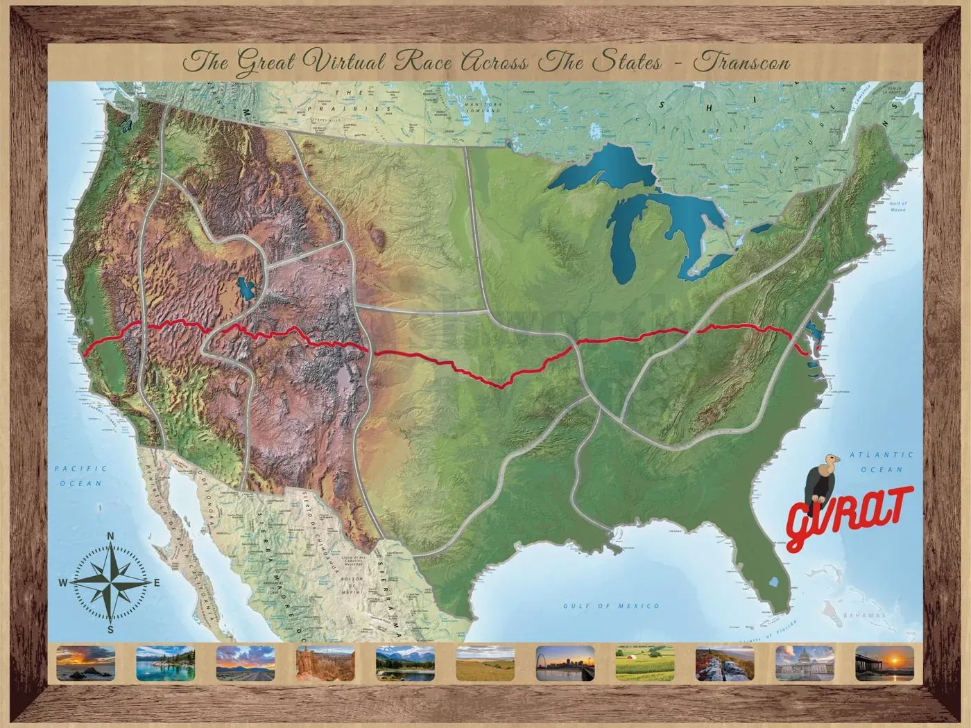
The board, with every region in place.
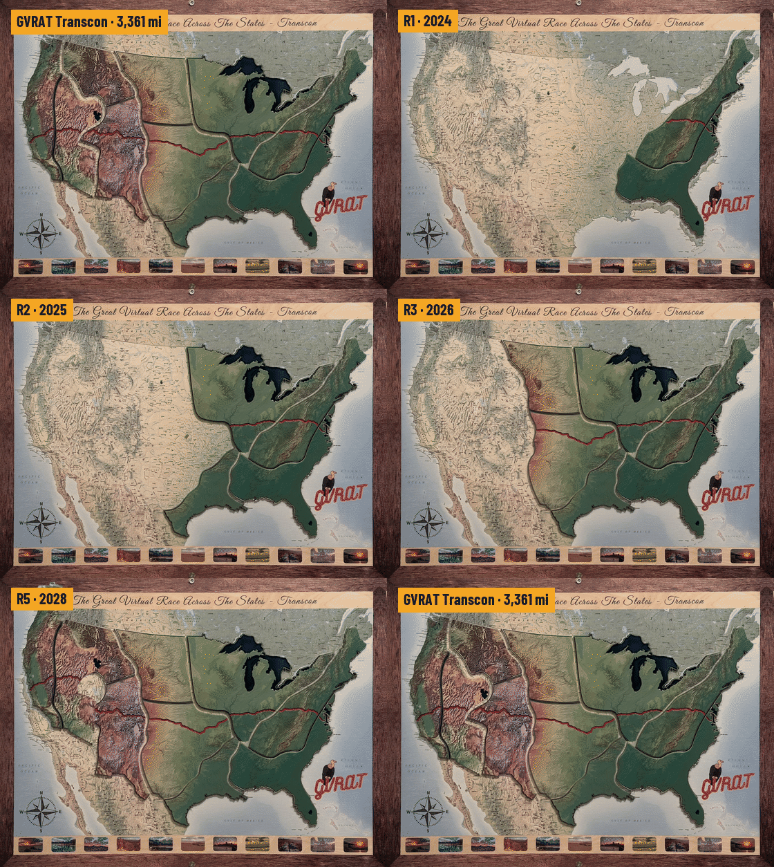
On the site and in the finisher emails, an animation built from photos of the real pieces drops them in, region by region.
Laz wrote about the board on the awards page, and about its final picture, the board with every medal in place: “the last picture? that is from naresh.” It’s the journey, finished.
4. Every past year, kept as it was
The GVRAT dashboard I built in the spring shows one race at a time. Next year’s will change, and a finished race should never be rebuilt with newer code that might show it differently.
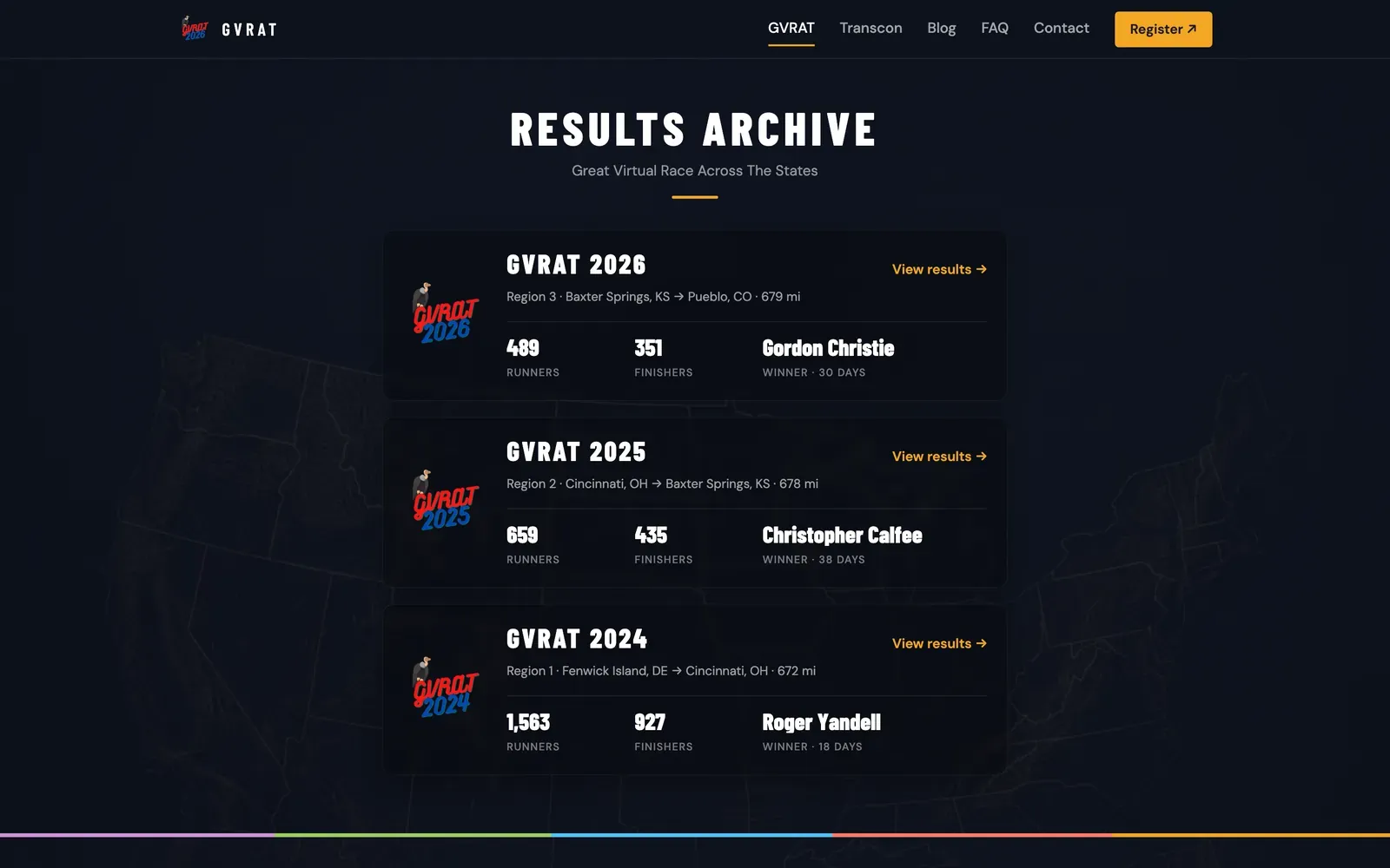
So the 2024, 2025 and 2026 dashboards now live in their own results archive, frozen exactly as they finished. The main dashboard is free to become GVRAT 2027.
It runs itself
None of this is updated by hand any more.
RunSignup (registrations and activities)
      │  every morning, GitHub Actions
      ▼
Python pipeline: group runners, count miles, apply the rules
      │  writes public JSON (no emails, phones or birth dates)
      ▼
Git commit → tests and data checks → deploy (only if everything passes)- Every morning, GitHub Actions pulls the latest registrations and activities from the RunSignup API, rebuilds every runner’s progress and commits the result.
- Every afternoon, my Mac runs a full sweep as a backup, and retries on its own if RunSignup drops a connection.
- History is frozen. Everything up to the end of September 2026 is saved once, so a re-run can never quietly change the past.
- Nothing reaches the live site without passing the tests. On both the website and the Transcon dashboard, browser tests check every page at ten screen sizes, from a 320 px phone to a 2,560 px monitor, and look for broken links, console errors and anything cut off. If a test fails, the live site simply stays as it was.
- The data is checked too. Every daily Transcon update has to pass over 1,600 checks before it goes live: the totals add up, every runner has a page, no region counts more miles than it has, and no email address or private field has slipped into the public files. When I added these tests a week after launch, they caught two layout bugs that were already live, both on small phones.
- Board orders take care of themselves. Display boards are sold through a separate RunSignup race. Each morning the pipeline reads the new orders and matches them to runners, so their emails know they have a board, and only flags the ones it can’t match.
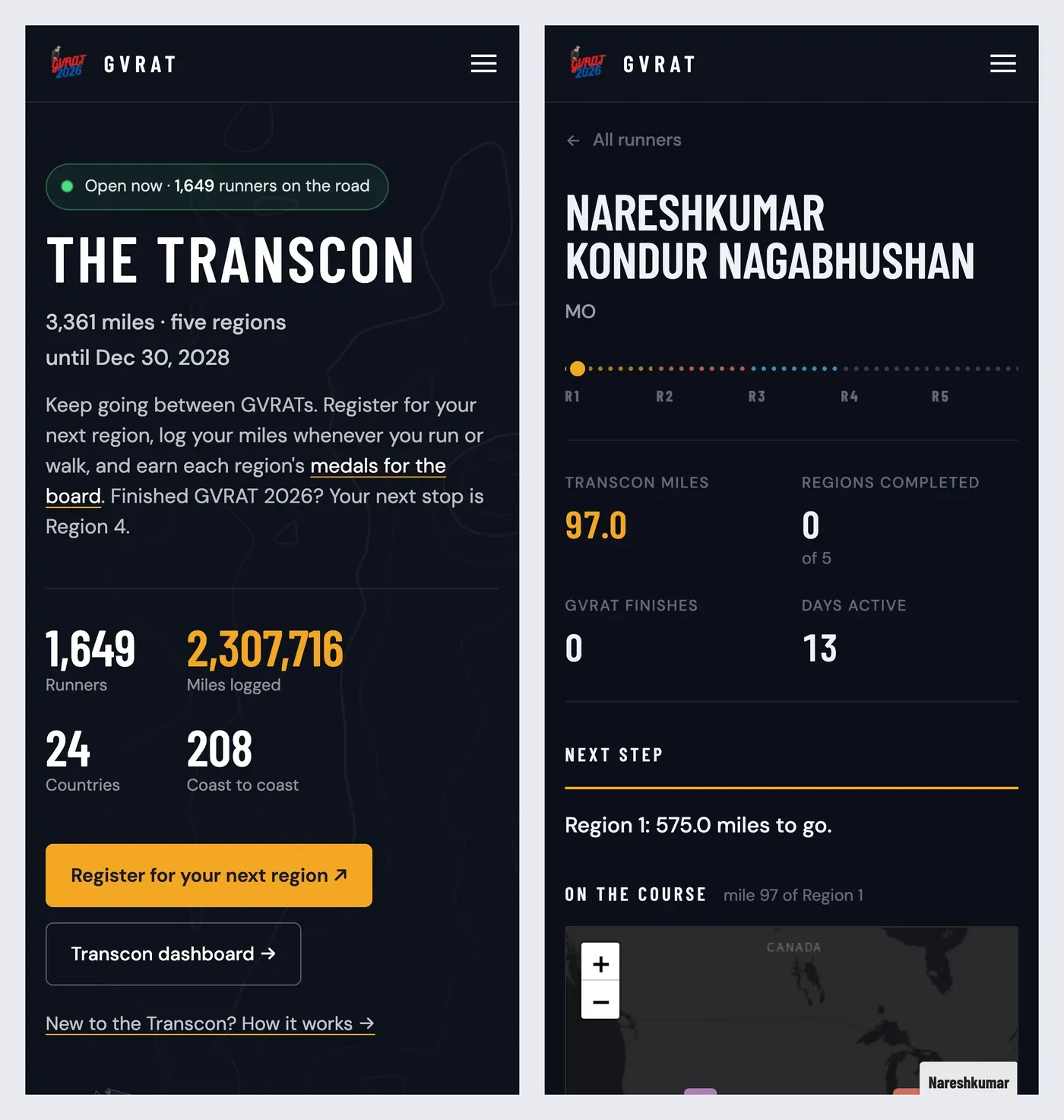
Most runners check in from their phones, so every page is designed for one first.
Talking to runners
With the data in one place, we could finally write to runners about their own race. This November we started emailing everyone who had finished the Transcon, and everyone with miles waiting for a region they hadn’t registered for yet.
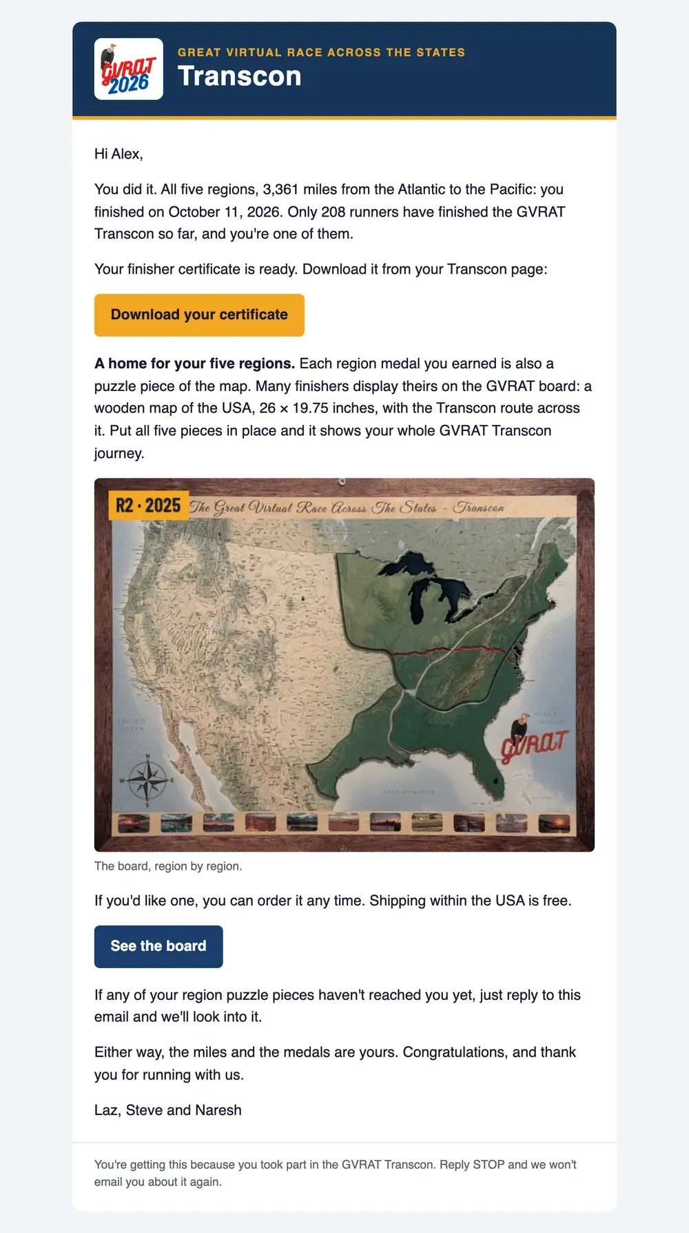
A sample of the finisher email, with a made-up name. Every email is written from that runner's own numbers.
Sending hundreds of personal emails is easy to get wrong, so the sending is built to be careful:
- Three kinds of email, chosen from each runner’s own page: finished with a board, finished without one, and miles waiting.
- Sent from our own address, through Google Workspace, with replies going to both race directors.
- Small batches first, each taking runners from every group in turn, so we could watch the first replies before sending the rest.
- Never twice. Every runner sent is recorded, and the send stops if the number about to go out isn’t the number we expected.
- “Reply STOP” really works. Before every send, the system reads our inbox for STOP and unsubscribe replies and takes those runners off the list. If it can’t read the inbox, it sends nothing at all. A late email is better than one to someone who asked us to stop.
Those were one-off emails. Since then, two more go out on their own every day, right after the update:
- A thank-you for registering, to each runner who signs up for a region, telling them where they stand: already a finisher, a region already complete, miles that now count, or a welcome to the road.
- A congratulations when someone completes a region or the whole Transcon, with their certificate when they’ve finished.
The thank-you ran in preview first, sending its emails to us instead of to runners until we were happy with them. Switching on the congratulations quietly noted everyone’s existing milestones first, so nobody was congratulated on last year’s news. And because medals ship in batches every month or two, the emails say a medal is earned and goes out with our next shipment, never that it’s on its way.
Trust is the product
A results site is only worth anything if runners believe it. So before we sent a single email, I treated it like an audit.
I downloaded a fresh export from RunSignup and checked the dashboard against it:
- Registrations matched exactly: 4,116 of 4,116.
- Activities matched exactly: 473,270 of 473,270, up to the frozen cutoff.
- An independent recount, written separately from the pipeline, agreed on 1,648 of 1,649 runners. The one that didn’t raised a real question: what to do with a run logged on two entries. We settled it the simplest way: every run a runner logs counts.
The audit also changed a rule. Steve sometimes mails a region medal a few miles early, bundled with others to save postage. The old logic counted a shipped medal as a finished region. The new rule is simple: miles come from RunSignup, and nothing else. Shipping records stay private and are only used to help Steve decide what to send.
The same care went into the honour rolls. While checking why one runner’s 2020 result was missing, I found that some of the most loyal runners in GVRAT history had been split across two rows when their email changed, so six runners who had finished every GVRAT weren’t in the Hall of Fame. And a few runners who share an email address with a family member had been shown that person’s finishing times. Both are fixed, and 93 runners split across two rows of the lifetime miles list are now one runner each, with their full miles. Five of them had simply lost the accented letters in their names in one year’s records.
We also made it easy for runners to correct us. Every results page now ends with a short note: missing a year, or listed under an old name? Email us. In the first week that brought in a changed surname, a 2020 race run under a nickname, and a runner whose two entries needed merging. Each was fixed within a day.
These lists are prestigious to the people on them. Getting them right mattered more than anything else on the site.
Privacy by design
- No personal details are published. Registration exports with emails, phones, addresses and birth dates never enter the public code. The site is built only from names, home state or country, and miles.
- Fewer third parties. Fonts are served from the site itself, and the Google map loads only when someone clicks it.
- Opt-outs are stored as one-way hashes, not email addresses.
Working with an AI pair programmer
As with my WTC 2026 dashboard, I built this with Claude Code as my pair. The habits that made it work:
- Rules before code. Every Transcon rule was agreed in plain English, with a real runner as the example, before it became a function and a test.
- Verify, don’t trust. The audit compared the site against RunSignup’s own export and an independent recount, not against itself.
- Small, reviewable steps. Every design change was shown to me before it shipped, and every change to the live site went through the tests.
- Clear boundaries. It never emailed a runner or changed hosting settings without my go-ahead, and private data never left my machine.
My job was the judgement: what a runner needs to see, what a fair rule looks like, and when the numbers were right enough to put our names on.
By the numbers
- About 10 days from the first Transcon commit (30 October) to everything live, including the new site, the archive, certificates and emails
- 21,500 runners and 18,180,242 miles on the lifetime list, since 2020
- 1,649 Transcon runners, 476,704 activities, 24 countries, 215 finishers so far
- 4,116 registrations and 473,270 activities matched exactly in the audit
- 98 browser tests at 10 screen sizes across both sites before anything reaches them, plus 120 pipeline tests and 1,656 data checks on the Transcon
- 0 personal details published
Thank you
To Steve Durbin, who knows every runner, every medal and every shipping box, and who read every email before it went out. To Lazarus Lake, whose idea this all is. And to the runners, who have now logged more than 18 million miles with us, one run or walk at a time.
Have an event that’s outgrown its website?
If you’re a race director or event organiser whose results live in spreadsheets and a website that’s hard to update, this is what it can become:
- Results that update themselves, every day, from the registration platform you already use.
- A page for every participant that tells them exactly where they stand and what to do next.
- Numbers you can stand behind, checked against the source.
- Certificates and emails that feel personal, sent carefully.
I’d love to hear about your event. Let’s talk →